Crafted with Character: A Tribute to Mark Smith’s Design Legacy

When a new logo project would come into the studio, we used to joke that Mark would be able to focus on nothing else. He loved bringing a new brand to life—working to distill down the very essence of a company into a combination of line and type to create something truly distinct. Guiding principles and key business objectives were printed out and taped to the glass in front of him. He would peruse stacks and stacks of design books for inspiration since internet searches weren’t quite as common then. From there he would start with simple doodles—trying to work through concepts and capture ideas.
The goal, always, was to create something that was fresh and distinct while being totally timeless. Mark avoided design fads religiously but took into account production opportunities for the logos. If it wouldn’t work well on the front of a baseball cap or a coffee mug then it just wouldn’t work. Here are a few of the marks that Mark personally had a hand in that live on today.
Roslyn
 Who would think that a blown out photograph from our walk around the beautiful Roslyn Conference and Retreat Center would become the foundation of their logo? Known as a place of retreat, rest and reflection, there are many benches scattered around the property. Under Mark’s imaginative eye, dramatic shadows from the image transformed into a cross alluding to their ties to the Episcopal Diocese of Virginia.

The Dog & Oyster
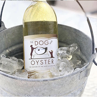 Well who doesn’t take pleasure in designing a logo and wine labels for a new winery? And when it is part of the lovely Hope and Glory Inn where we spent many company retreats it was all the more special. The logo celebrates the terroir/merroir pairing of their wines with oysters as well as the rescue dogs that lived at the vineyard to keep deer away from the grapes. Cheers!
Commonwealth Commercial
In an effort to consolidate the many facets of this commercial real estate business under one brand umbrella, a new identity was created with the tagline of “Comprehensive Property Solutions.” Using curved elements to imply space and nod back to the two “Cs” in their name, this logo is visible all around Richmond at the many properties they represent and manage.
Timmons Group
 Our discovery uncovered that this was a mission-driven civil engineering firm which placed great emphasis on understanding their client’s vision thoroughly—allowing them to create solutions and execute projects beyond what was expected in nine main service areas. This became the inspiration for their logo and tagline “Your vision achieved through ours.”
ImpactMakers
 This purpose-driven consulting firm and certified B-Corp wanted an identity that fully illustrated their brand personality. Community centric. Energetic. Passionate. Professional. Disruptive. Edgy. Innovative. Taking that to heart, the logomark was based on the most important adjective to them, “Impactful.” An exclamation mark used to indicate strong feelings is also an abbreviation of the word “impact.” The negative space inside the “m” suggests profiles of people within the company and the community they serve.
Brown Distributing
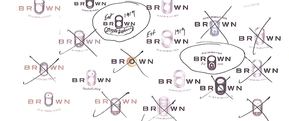
 Virginia’s premier beverage distributor wanted to refresh the brand for their fourth generation company. After exploring up to ten different directions, we landed on replacing the “O” with a can tab. A lot of thought went into the type of tab and how it would pair with the typography to ultimately create a logo that really popped.
RiverFront Investment Group
 Evolution or revolution? We are quite often faced with this question as we approach a brand “refresh” with a client. In the case of this asset management firm, the logo evolved with bolder, more unique typography and a streamlined color palette. This was paired with vivid imagery and a tagline that clearly articulated their unique approach to investing. We are grateful to still be working with this client fourteen years later.

VA Council of CEOs
 Creating the brand and supporting materials for the VA Council of CEOs was an outcome of becoming a member of this wonderful organization. And while there has been an evolution of the brand over the years, the mark has remained the same.
Piascik & Associates
 In 2004, Steve Piascik came to us needing help in developing their brand. This wasn’t your ordinary CPA firm. They leaned into the notion that “Big is good. Smart is better.” and allowed us to create a brand and materials that stood out. Engaging illustrations, unique printing techniques, and bold language set the stage for their differentiating offerings in the sports, medical and international arena. Eight years later, they returned for an evolution of their brand. Recognizing that they were known simply as “Piascik,” we maintained the equity of their logomark by incorporating it into an updated logo. It is a brand that serves them well to this day.

circle S studio
 Who is the most challenging client we have ever worked with? Ourselves! Trying to finalize our name and logo was a difficult process—since it’s hard to read the label when you’re inside the jar! But once we did, it felt perfect and still does twenty-five years later. Our name reflects the origins of branding, when ranchers would brand their herds to set them apart from others. Each element also carries its own meaning:
• The circle, a unified shape with equal importance and balance, reflects our belief that the best work comes from having multiple voices at the table. It also expands to accommodate new points of view while retaining its strength and integrity.
• The S in the center stands for strategy, which is at the core of everything we do.
• Instead of agency, we chose the word studio, to emphasize our passion for creativity that elevates brands with artful expression and meticulous attention to detail.
From his personality to his philosophy to his work ethic and his humor, Mark Smith was an embodiment of our company. He was our logo, in the flesh.
Parting Reflection
 Meet “Ricky”—the alien that Mark snuck into someone’s chair at the studio one day—much to their surprise! We’re sure that many former interns have memories of having him show up unexpectedly. And yes, Mark, your mischief lives on.
"*" indicates required fields
By signing up you are agreeing to our Privacy Policy.