ADA Color Compliance for Websites: A Quick Guide

Web accessibility plays a crucial role in ensuring your site is legally compliant and providing inclusive and more effortless user experiences, especially when it comes to color.
The Americans with Disabilities Act (ADA) is a law that prohibits discrimination against individuals with disabilities in all areas of public life, including websites. In the context of web design, the ADA encourages businesses to follow best practices and standards set by the Web Content Accessibility Guidelines (WCAG) 2.1.
With attention heightening around the topic, it’s best to be proactive in responding to user needs and anticipating future laws to ensure the accessibility of your website for any user.
WCAG 2.1 specifically identifies three levels of compliance when it comes to a site’s accessibility: A – rules with which you must comply with by law; AA – rules with which you should comply (optional); AAA – rules with which you may comply (optional and rare).
In this article, we’ll explore each of these levels of compliance and explain why these rules matter for businesses operating in the United States. We’ll also provide several key tips and best practices for ensuring your site is compliant with all relevant laws.
Understanding the basics of website ADA color compliance
Color plays an essential role in how we understand the world around us. However, the ability to see color or to distinguish between different colors should never be a barrier to understanding the content or function of a website.
For this reason, Congress has enacted rules through the ADA to set a minimum bar for how color is used on websites. These rules also provide guidance for how businesses should use color to be as accessible as possible for individuals with disabilities.
In general, there are four key principles you should aim for when optimizing a website for accessibility:
- Perceivable — Information and UX components on your site must be presented in a way that users can perceive regardless of any potential disabilities.
- Operable — UX components and elements must be operable through a variety of input methods, and must not have barriers for users who rely on one or more unique input methods, such as those who navigate with only their keyboards.
- Understandable — The site must be intuitive and easy to understand, with UX elements in place to provide direction and meaning to the site’s functionality.
- Robust — The code that powers the website must be robust enough to function with a wide variety of user agents and assistive technologies, such as screen readers.
Color accessibility generally falls under the first and third principles, as they relate to how well a user can perceive and understand the content you present on each page.
What are the requirements for color accessibility?
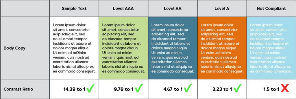
A quick table showing different examples of color contrast for each level of compliance.
WCAG 2.1 outlines the rules and guidelines for each level of website accessibility. In general, the contrast between the text and background color and a user’s ability to perceive and understand the content is the biggest difference between the three levels:
- Level A (Minimum Legal Requirement) — To pass this level, color cannot be used as the only visual means of conveying information, indicating an action or element of functionality, prompting a response from a user, or distinguishing a visual element. Generally, the solution to pass this level is to add additional design and UX elements to the site to ensure color is not the only indicator or differentiator of content or function.
- Level AA (Minimum Recommended Contrast) — In addition to the requirements of Level A, the text on the website must have a contrast ratio of at least 4.5 to 1, except in the case of large-scale text (which needs to have a contrast ratio of 3 to 1), purely decorative or aesthetic text, and logos. Often, this will mean careful consideration of background elements and text coloring to ensure sufficient contrast between the text and the background it’s placed on.
- Level AAA (Enhanced Contrast) — In addition to the requirements of Level A, the text must have an even higher contrast ratio of at least 7 to 1, except for in the case of large-scale text (which needs to have a contrast ratio of 4.5 to 1), purely decorative or aesthetic text, and logos. Generally, this requirement limits your ability to use strong or dark backgrounds behind text without sufficient backing, such as highlighting.
Additionally, it’s important to note that these requirements generally only apply to elements of the website that are essential for understanding the content or functionality of the page in question. Purely aesthetic elements, such as a logo or the details of a background image, are not required to be ADA-compliant since they are aesthetic, not semantic in nature.
Why should firms care about ADA compliance?
Legal action against websites with accessibility issues has been on the rise in recent years, with researchers forecasting more than 4,200 lawsuits by the end of 2023, doubling the 2,300 lawsuits seen in 2018. While around 84% of these lawsuits were against eCommerce sites, the data still presents a growing trend of legal action against websites that fail to meet minimum accessibility guidelines.
However, the more important thing to remember is that following accessibility guidelines is simply good for users.
The U.S. Department of Justice’s Civil Rights Division puts it best in their guidance on web accessibility and the ADA:
The ways that websites are designed and set up can create unnecessary barriers that make it difficult or impossible for people with disabilities to use websites, just as physical barriers like steps can prevent some people with disabilities from entering a building. These barriers on the web keep people with disabilities from accessing information and programs that businesses…make available to the public online.
When 1 in every 12 men and 1 in every 200 women have some form of color vision deficiency, making sure these individuals can perceive and understand the content on your website plays a crucial role in ensuring a positive browsing experience for your users.
Tips for improving your site's ADA color compliance
Given the importance placed on ensuring ADA compliance and strong color contrast, marketing departments will often gravitate toward a few common strategies for ensuring their sites are as accessible as possible:
- Think of your website in black and white, then add color to make it “pop” — A common strategy for building sites with a higher level of accessibility is to design certain elements in black and white first before adding any color. This helps ensure all elements are distinguishable through other means, such as icons or patterns, ensuring that the final designs are as accessible as possible.
- Prioritize accessibility when choosing a digital color scheme — It’s important to note that you can and should expand your brand’s color palette for the web to ensure you can provide sufficient contrast for your website’s colors. Small additions, such as adding different shades of your primary brand color, can go a long way to ensuring your backgrounds and other elements are flexible enough to accommodate users with disabilities.
- Use textures, iconography, and movement to add contrast and meaning — A website redesign is a golden opportunity to create textures, patterns, and iconography that can complement your brand and add meaning to various elements of your website. A button with an icon or arrow that animates on hover, for example, is an excellent way to provide a clue to users about the element’s functionality without relying solely on color.
- Work with your designer to make accessibility a priority — Finally, it’s important to note that the best way to ensure your site is as accessible as possible is to speak with your designer about your goals as early as possible. If your business has a goal of improving accessibility, your designer will want to account for the heightened requirements early in the process to ensure your site is as compliant and user-friendly as possible.
ADA compliance plays a critical role in user experience
With such a large percentage of Americans having difficulty distinguishing between certain colors, it’s plain to see why many businesses are making ADA compliance and web accessibility a priority in their website redesign projects.
The key thing to remember when it comes to the ADA is that your site needs to be perceivable, operable, understandable, and robust to all of its visitors. In the context of colors, this means ensuring your design doesn’t rely too heavily on color to convey content or functionality, as well as spot-checking different elements around your site for color contrast.
Regardless of how you approach ADA compliance, however, the most important thing to keep in mind is that your design should provide a better experience for your users. Even if it means slightly altering the colors you use on your website or changing your preferred background, ensuring your site is as accessible as possible is a valuable tradeoff that can help you accommodate audience members no matter their impairment or ability.

"*" indicates required fields
By signing up you are agreeing to our Privacy Policy.