5 Methods for Building a Data-Rich Dashboard for Your Professional Services Firm

Choosing the right data visualization method can help you build a dashboard of key business insights to drive decision-making and spur results.
All businesses need and rely on insights drawn from the data they collect across their organization, from sales and business development to marketing, human resources, and information technology (IT).
However, effectively collecting and compiling this enormous amount of data in a way that’s helpful to business leadership can often become a struggle.
As noted by James Clear in his book Atomic Habits, a plane that takes off in Los Angeles toward New York City with a minor error in its heading of just 3.5 degrees to the south will instead end up in Washington D.C. Especially when it comes to large organizations doing billions in revenue per year, small adjustments at the onset of a campaign or program can have massive consequences in where your firm ends up months if not years down the line.
Clarity in where your firm has been, where it’s currently headed, and where you ultimately intend to land, then, is critical to ensuring your business remains on track toward your goals and in line with your vision.
This struggle surrounding the collection and presentation of data is why many firms choose to aggregate and summarize this information into an easy-to-digest dashboard that both provides a quick, top-down overview of the business’s or the department’s health and drives decision-making through better presentation and data visualization.
In this article, we’ll explore five key methods and strategies that middle-market professional service firms can implement to collect, manage, and present key business insights to leadership teams more effectively.
1
Build a Basic Report with Simple Chart Editors: Microsoft Excel, Google Sheets, Keynote, and Microsoft Powerpoint
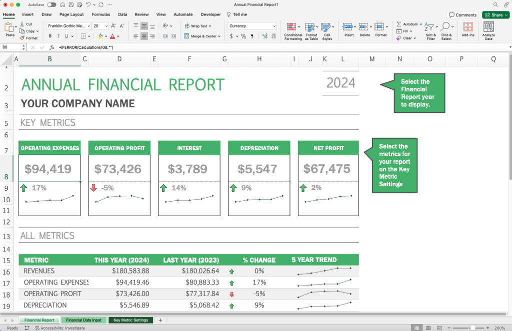
A screenshot of a financial report generated using a Microsoft Excel template.
One of the simplest and most straightforward solutions for presenting business insights is to aggregate key data into a spreadsheet, and then to use those tables to build out graphs and other visualizations that can help you tell the data’s story to your team members.
Microsoft Excel, for example, contains a wealth of tools and integrations for finding meaning in data, from PivotTables to help you sort through your data to compact visualization solutions like sparklines that can quickly identify trends within datasets.
Depending on your firm’s workflow and reporting practices, you can build out datasets in these workbook tools and then either combine multiple visualizations into a single native dashboard (as seen above) or export your visualizations and charts as images to be placed into a separate presentation tool, such as a Keynote or PowerPoint template that aggregates data insights from across your organization.
2
Leverage the Google Ecosystem: Google Search Console + Google Analytics 4 (GA4) + Google Looker Studio
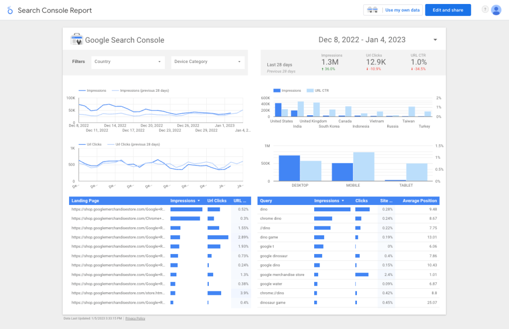
A screenshot of the default Google Search Console Report in Google Looker Studio.
Marketers often gravitate to the Google reporting ecosystem due to the ease of integrating tools with both their firm’s website and any ongoing marketing and lead generation campaigns.
From search engine optimization (SEO) data collected through Google Search Console to website and campaign data stored in Google Analytics 4 (GA4), one of the best solutions to collect and report on digital marketing campaigns is to build out real-time dashboards in Google Looker Studio that can help you track your firm’s leading measures and give you the insights you need to remain agile and competitive in the broader marketplace.
Importantly, tools like Google Looker Studio also empower you to connect your dashboard to other data sources alongside GA4 and Search Console, such as recording sales, business development, or employee satisfaction data into a Google Sheet and using that to build out a visualization in your report.
3
Use an Automated Online Data Visualization Platform: Databox, Whatagraph, Domo
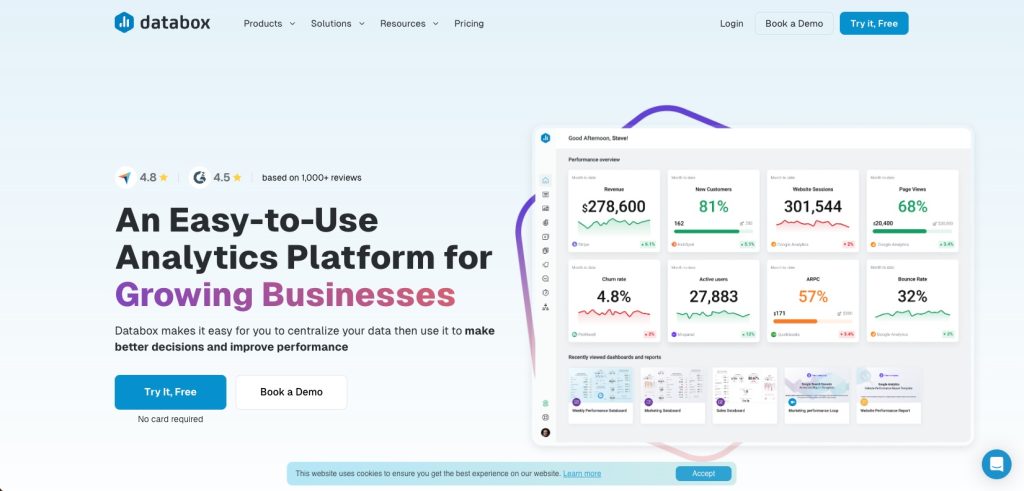
A screenshot of the Databox home page, showing an example dashboard next to their value proposition.
Over the past several years, different online data visualization platforms have cropped up with the goal of connecting together otherwise disparate reporting technologies into a singular, automated real-time dashboard.
Tools such as Databox, Whatagraph, and Domo all strive to help marketers and business analysts centralize their reporting into a single platform.
The key advantage of using these technologies is primarily convenience, as they generally set somewhere between the manual data entry required for a solution that leverages spreadsheets and the fully automated, presentation- and reporting-focused solutions offered by Google Looker Studio.
In most cases, if you simply want a concise, singular dashboard that offers a 10,000-foot look at how your business is performing online, a solution such as one of the three mentioned may be an effective strategy for quickly and easily setting up a report that works for you.
4
Consider AI-Based Data Visualization Solutions: Polymer, Sisense, Akkio
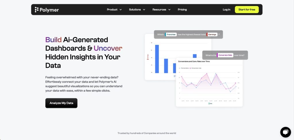
A screenshot of Polymer’s artificial intelligence (AI) page showing example graphs and their value proposition.
The rise of AI-infused technology solutions since the release of ChatGPT in March of 2023 has led to the creation of several different AI-empowered data visualization tools such as Polymer, Sisense, and Akkio, as well as the integration of machine learning technologies into numerous other tools across the data visualization landscape.
Generally speaking, these tools all aim to leverage machine learning as a means of both improving the presentation and reporting of data (by finding patterns in how data is displayed) and expanding the speed of data analysis through recommendations and suggestions generated by having an AI program analyze datasets to look for patterns or anomalies.
While there is still a distinction between the tools that leverage AI and those that don’t, the market as a whole is progressively shifting toward solutions that embed machine learning technology as a means of providing smarter and faster analysis of large and complex datasets.
5
Build on Strong Foundations with Industry-Leaders: Saleforce's Tableau and Microsoft's Power BI
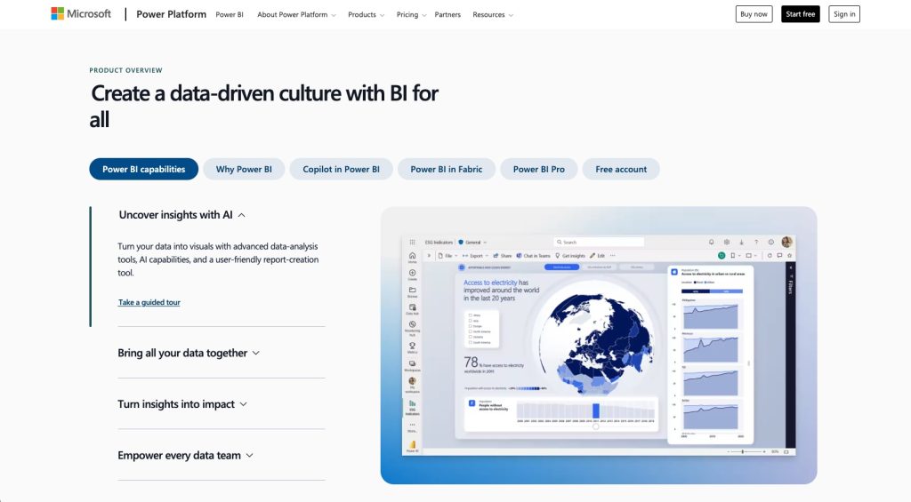
A screenshot of the Microsoft Power BI homepage.
For larger organizations that flex the full muscle of enterprise-level software such as Salesforce or Microsoft’s suite of business tools, it may be beneficial to leverage the built-in, advanced solutions that are present in these industry-leading ecosystems.
Most notably, this is where enterprise-grade dashboard and analytics solutions such as Salesforce’s Tableau and Microsoft’s Power BI enter the fold as the dashboarding solutions of choice for large organizations looking to standardize reporting across their entire technology ecosystem.
Empowered by cutting-edge technology and leveraging the latest in machine learning and AI solutions, these tools offer a best-in-breed experience to professionals who want a truly holistic experience.
However, the cost in time and resources to become fully integrated, combined with the steep learning curve when compared to other solutions, mean that these tools are often the “end goal” of a robust dashboarding and analytics solution rather than an entry point into the ecosystem.
Choose the data visualization solution that helps you identify and act on business insights
Visualizing and interpreting key business data is the first step in gaining greater, real-time clarity into how your business is performing across various areas, from the effectiveness of marketing campaigns to the happiness and satisfaction of your employees.
For this reason, business leaders should be empowered not only in their ability to quickly access and understand this information but also in how this data guides future decisions and policies across the broader company.
Often, dashboards are the chosen solution to this issue, offering a quick glance into the beating heart of an organization and acting as a stepping stone into larger discussions about the effectiveness of different areas of a business.
When building out a dashboard for your organization — whether in an Excel spreadsheet, through a third-party tool such as Databox, or with enterprise-grade tools such as Tableau or Power BI — the key thing to remember is that the purpose of such a dashboard is ultimately to shed light on the trends and patterns in your data as a means of either confirming the effectiveness of a particular program or identifying room for improvement across different metrics.
By regularly monitoring your dashboard and pairing this monitoring with a culture of continuous improvement, you can propel your organization toward a smarter, more agile future.
Curious to learn more about data visualization? Check out our webinar, Building a Data-Rich Dashboard: Important KPIs to Track.
"*" indicates required fields
By signing up you are agreeing to our Privacy Policy.