6 Questions That Heatmap Analytics Can Answer About Your Website

Your website analytics are essential to understanding how your site is performing, and user experience is a crucial part of that. While your performance analytics will give you a lot of the “what,” heatmaps can help answer the “why,” helping you drill down into improving user experience.
A heatmap is a visual representation of user behavior. A heatmap analytics platform will load a JavaScript file in your visitors’ browsers, and then the heatmaps show aggregations of all the recorded data. It displays as a screenshot of an individual page with a range of colors overlaying different areas of the page to represent engagement. Like any other heatmap, red signifies a higher frequency, and blue or purple signifies a lower density of activity.
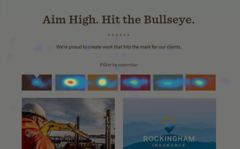
There are a few different kinds of website heatmaps. One is a click heatmap, which shows where users are clicking on your website and how often. The denser spots of red are where users have clicked the most.

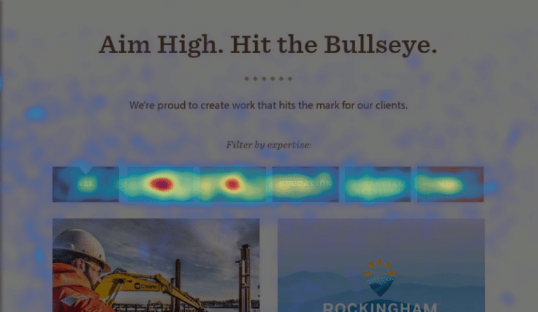
Move heatmaps record and display users’ mouse movement on your page. These heatmaps are particularly insightful because there is a high correlation between mouse movement and eye movement.

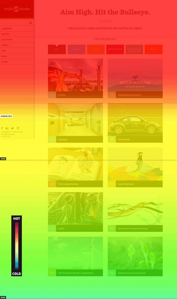
Thirdly is a scroll heatmap, which visually represents how far visitors are scrolling down a page. Red indicates that all visitors have seen that section of the page, and the gradient turns cooler as less users scroll down the page. Scroll heatmaps also show the percentage of visitors that scrolled to each point on the page.

Many heatmap tools also have the ability to collect session recordings. A session recording is a real-time screen recording of visitor sessions on your website, showing their mouse and scroll movement, where they click, and what pages they visit. The recordings can support your findings from your heatmaps and serve as clear examples of visitor interaction and behavior.
Heatmaps are valuable because they answer the “why” of your performance analytics — such as why you have a high bounce rate, or low time on page. They take website testing to the next level, with data from real users that are often unfamiliar with your site, and display it in a visual, quantitative way. There are many insights you can glean from heatmaps about user experience on your website, the client journey, and holes in website content or structure. Here are 6 questions that heatmaps can answer about your website.
1
Is your site’s structure and navigation working?
When you look at your click heatmaps, which menu items get the most clicks? Which ones aren’t clicked at all? This gives you insight into how intuitive your navigation structure is, which pages are most popular and which pages are being ignored. If a certain menu item is receiving minimal clicks, that page may not be important to your visitors, or perhaps the language is confusing. Consider removing it or moving it to be child page. Your main navigation items are valuable real estate on your site, and something else that you’d like to draw attention to could take its place!
2
Where do users stop reading your content and drop off the page?
Use scroll heatmaps to see how far users are scrolling down your pages. Is there any correlation between drop-off percentage and the type of content on the page? Or location of content? If you have a big drop in scroll percentage over a short amount of scroll space, you might have a content issue. The copy could be confusing, boring or too long, or it may not be what the visitor was looking for when they clicked on the page.
This is an example of where A/B testing can be really helpful. Run heatmaps on your original page to capture a benchmark of data, and then test your edits to see how visitor scrolling and click frequency changes.
3
How effective are your calls-to-action?
Insights from both your scroll and click heatmaps can be valuable in guiding your call-to-action design, copy and placement. Do visitors find them compelling enough to click? Do they even see them? The click heatmap measures the effectiveness of your CTAs, and the scroll and movement heatmaps can help inform why they may not be getting as many clicks. If there’s little mouse movement, or if the scroll heatmap shows most users aren’t reaching the point of the page where the CTA is, then it could be an issue with placement or design. Heatmaps also prove helpful when A/B testing your calls-to-action.
4
Where are there glitches or places that users are mistakenly clicking?
Heatmaps are all about user experience, and there’s no substitute for watching real users navigate your site. Heatmaps show you places users are clicking on your site that aren’t actually links or interactive content. Sometimes this is a development bug – an expand-collapse section may be broken, or a button misaligned. Other times, part of a page design may be misleading and look like a link or button when it’s not, causing users to click until they realize it’s not what they expected. This leads to user frustration, high bounce rates, and low conversion rates. Noticing it in a heatmap enables you to fix bugs and make adjustments that you may not have known you needed to do otherwise.
5
Where are the areas of opportunity?
As you begin to analyze your heatmaps, you’ll notice areas of opportunity on your website. If a page receives a high frequency of clicks but isn’t listed on your main navigation menu, it may be a good idea to add it. And if there is high frequency of movement over some interactive elements on a page, you may want to assure you’ve placed calls to action or relevant content there to take advantage of the highly-trafficked area.
Pay attention to which related posts and featured content are receiving the most clicks, and switch out the ones with minimal engagement. The visual nature of heatmaps really highlights what areas of your site are “hot” and where you should seize the opportunity to strategically edit your layout, structure and content hierarchy to match your users’ behavior.
6
How well is your site optimized for mobile?
Each page you run a heatmap for will create different heatmaps for each device type (desktop, tablet and mobile). Because 80% of B2B buyers use mobile at work, we can’t deny its importance in the client journey. How are visitors interacting differently with your website on different devices? Are they scrolling through and reading the same length of content that they are on desktop?
With smaller screens and larger text, it’s typical for content on mobile pages to be optimized to be shorter and easier to consume. But if you find that your visitors are finding the content compelling enough to scroll through the page, don’t change it!
Also look at where people are clicking. A mobile click heatmap will show “taps,” which also include where users are scrolling (by tapping and dragging) or zooming in. There could be a high frequency of taps on a headline because it resembles a button on mobile and users think they can click on it. Or some buttons may be too small for fingers, and therefore there are a lot of taps surrounding it. Screen recordings are helpful here so that you can actually watch user behavior and see any issues they’re having with the mobile interface.
Pair heatmaps with other analytics for best insight
Heatmap analytics offer a wealth of insight into your user behavior, but your findings are most valuable when paired with other quantitative performance analytics such as Google Analytics.
If you know you have a low conversion rate on your landing page, your click heatmap may show that the call-to-action is inconveniently placed on the page. Or on another page, you may see that most users are scrolling all the way to the bottom, but the average time on page is really low. This could mean that users are skimming the page but not finding the content they were looking for, so you may need to revisit your copy or structure the content in a more readable way.
It’s easy to get caught up in assumptions and gut feelings about what’s best for your website, but heatmaps will better inform your decisions and teach you about your website visitors. You’ve spent quite a bit of time on the strategy, design and development side of your site—now it’s time to walk in the shoes of your visitors!
"*" indicates required fields
By signing up you are agreeing to our Privacy Policy.