5 Tactics to Increase User Engagement on Your Website

User engagement metrics such as Views per Session, Average Engagement Time, and the number of Conversions are all great indicators of the health of your content marketing efforts.
No matter what your current engagement metrics are, there’s always room to improve. From tactics such as improving click-through rates on your CTAs to developing more thorough content funnels to send your users through, there are numerous ways to elevate your website’s engagement and take things to the next level.
In this article, we’ll explore five time-proven tactics for increasing engagement across your website.
1
Use compelling CTAs
Calls to action (CTAs) are user navigation tools that can help you funnel your audience toward business-focused pages such as your Contact page, a webinar download, or product and service pages.
CTAs are effective from an analytics standpoint because they provide clear direction to users about what their next step should be.
In the contexts of user engagement, CTAs are helpful because they tend to lead to clicks to additional pages and push users further down your funnel.
This increased engagement can be directly measured in metrics such as Views per User or Average Session Engagement Time, which record how many pages the average visitor looks at and how long they tend to stay on the site.
Website CTA Best Practices:
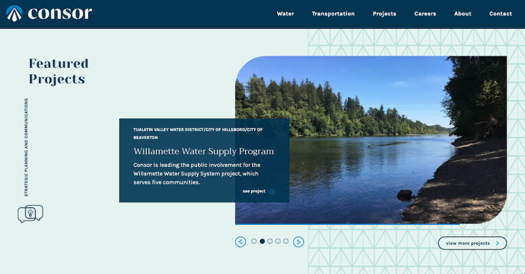
- Use buttons with compelling colors or micro-animations to make your CTAs stand out from the surrounding page (glance value is key)
- Avoid generic copy such as “read more” — try to use descriptive copy such as “view insight,” “browse open positions,” or other text that helps the user predict how your site will respond
- Try not to stuff too many CTAs onto one page, make your website’s navigation patterns clear for your users and simplify the experience
2
Simplify your navigation
Web designers and developers follow general guidelines when building websites — such as the commonly touted rule that no page should be more than three clicks away at any given time.
However, guidelines such as this are just that — guidelines.
In practice, your first and only concern should be to make it as fast and easy as possible for users to find the content they’re looking for.
Take Stripe for example:
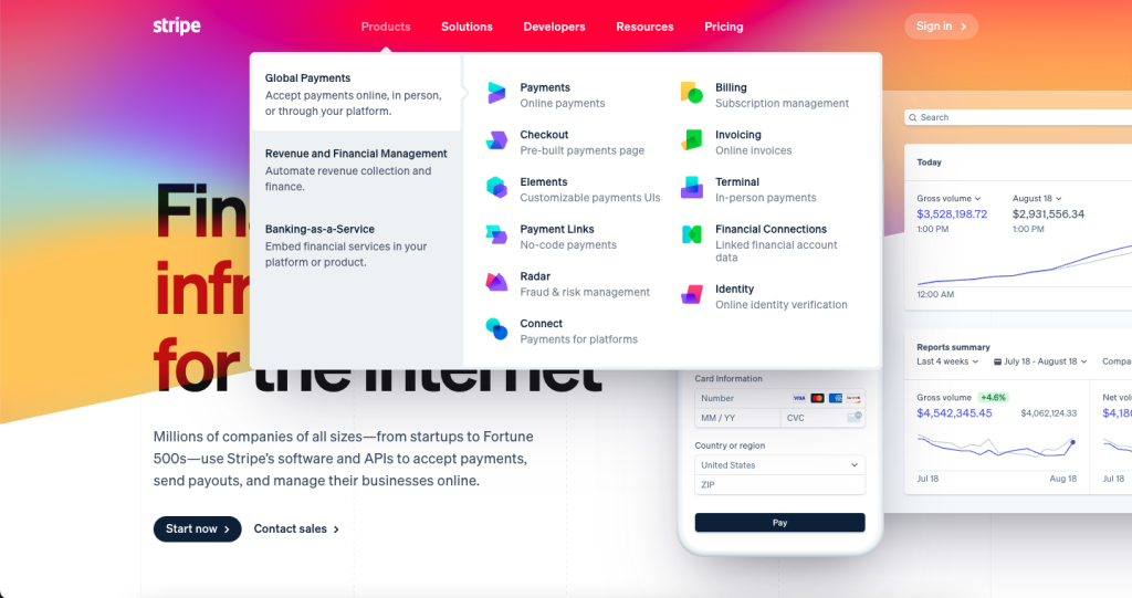
Stripe is a payment processing SAAS business that supports around 20% of all ecommerce transactions processed online.
With quite literally thousands of pages listing their various products, solutions, developer resources, knowledge base content, and more, they’ve taken great care to simplify their navigation into distinct silos based on the primary intent of their users.
In their primary menu’s simplicity, they’ve found an organized way to direct users to the content that matters to them — whether that’s business stakeholders looking for payment processing solutions or developers trying to find a particular webhook or API for their project.
Put another way, the simplicity of your navigation elements should primarily stem from a clarity of user intent. All users — no matter what they’re looking for — should have a clear and easy-to-understand path toward the content that’s relevant to them.
In practice, this means removing unnecessary clutter from your menus as a means of clarifying the best path forward. No primary menu should have “Insights,” “Blog,” “Thought Leadership,” “Downloads,” etc. right next to each other, as this muddies the next step a user should take to read your content.
Instead, add a simple link titled “Resources” that leads to a page listing all your content in an easily scannable fashion, and consider adding a dropdown that directs users to individual sections if they so choose.
Much like with CTAs, your other navigation elements should have a clear, easily identifiable, and unique purpose. Simplicity reduces friction and helps drive users to the content on your website that really matters.
Optimizing your navigation can improve retention, improve user satisfaction, and increase your average time on page (since it’s easier for users to find exactly what they’re looking for the first time).
Website Navigation Best Practices:
- Ensure your main pages (Careers, About, Services, etc.) are prominently displayed and easily accessible in your primary nav menu
- Make use of dropdowns, mega-menus, and other organizational tools to contextualize subpages underneath your main pages
- Don’t overstuff your primary navigation — remember that your main nav is for users and try to only add content that’s directly relevant to them
- Make use of supplementary navigation tools such as a more robust footer, sidebar elements, and CTAs to provide easy access to your most relevant content
- Design and develop navigation-focused pages to help users find content — examples include “Category” and “Tag” pages as well as more central pages such as a list of your locations, services, or other content that directs users to where they want to go
3
Add video and upgrade your content
If you want to improve user engagement, you need to provide users with something to engage with. A common strategy in this vein is to upgrade your already engaging content with supplemental elements that can help drive conversions.
For example, imagine that you have an immensely popular post on prestressed concrete that’s driving significant traffic to your blog. Rather than spending time elsewhere, why not take a few hours and really up the value for that particular page?
Make a video where a subject matter expert explains their perspective on the content, have a designer create a simple graphic that explains a process, add additional internal links to the copy to drive users to other areas of your blog.
Find ways to drive user engagement (clicks, views, downloads, etc.) and supplement your existing top content with elements that enhance and elevate the user experience.
Content Elevation Best Practices:
- Provide helpful internal links to other content that can provide an avenue for further reading
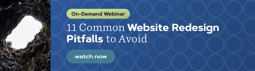
- Add engaging visual elements such as videos and images for users to linger on — but make sure these visuals support and add to the content’s purpose (don’t add purely decorative content)
- Add links to free downloads and lead magnets such as webinars to capture user information and provide additional value
4
Decrease loading times site-wide
This is a tactic that is best described with a few statistics:
- Sites that load in 1 second convert 3 times more than sites that load in 5 seconds, and 5 times more than sites that load in 10 seconds
- The probability of a user bouncing (leaving your site without engaging) increases 32% as page load time goes from 1 second to 3 seconds
- More than half of users would give up animations and video if it meant that a website would load faster
Taken together, these statistics paint a very compelling picture. Namely, page speed has a direct and pressing impact on the user experience — so much so that it can be the make-or-break factor that causes a user to leave your site.
Page speed has a direct correlation to a page’s conversion rate, to the extent that companies as large and established as Walmart have found that every 1 second improvement in page load time immediately results in a 2% increase in conversions.
In the contexts of user engagement, pages that load quickly just “feel” better than ones that don’t — and this feeling often leads to increased engagement rates and longer sessions due to the improved user experience.
Page Speed Best Practices:
- Optimize your images and code — these are often the biggest offenders in page speed tests as they increase the total weight of the page
- Leverage caching and other tools to reduce the time it takes for assets to load
- Invest in a server that is optimized for speed and can handle the amount of traffic flowing around your site
5
Upsell lead magnets and other gated content
Lead magnets such as webinars and whitepapers act as the crème de la crème of most content marketing strategies — offering exceptional insight and value for the user at the cost of an email or other piece of information.
The important thing to understand about lead magnets, however, is that they aren’t for everyone. Specifically, lead magnets are useful for a very particular type of user — the one that wants to dive deeply into your insights at a level insufficient for a blog post.
Viewed from a different perspective, lead magnets are a primary driver of engagement for members of your audience that are already engaged and willing to engage more.
Think for a moment about the type of user that downloads an ebook or subscribes to a webinar — what qualities do they share?
Often, they are the ones that have already read a blog post about a subject or engaged with your content in another way, and are choosing to engage further by offering their contact information in exchange for something of value.
With this idea in mind, it’s easy to see why having unique and valuable lead magnets linked across your website would be beneficial for driving user engagement. Specifically, lead magnets are a driver of elevated engagement and a path for your most engaged users to interact with you at a higher level.
Further, by positioning this content behind a form submission, you can accurately identify and track these exceptionally engaged users through your customer relationship management solution via cookies and lead nurturing email campaigns.
Lead Magnet Best Practices:
- Create unique content that elevates your thought leadership and provides immense value to your audience
- Gate this content behind a form so you can collect contact information and further engage your audience members with lead nurturing campaigns and other related resources
- Promote your lead magnets across your website — particularly in areas where you know your most engaged visitors spend their time (usually insight posts and resource centers)
Keep the pulse of your website's performance
User engagement is the most important metric to track when monitoring the health of your website. If users aren’t engaging with your content — or are engaging less than you would like — it may be time to implement a few of the strategies noted above to see if they can have an effect on your numbers.
Note, however, that the five tactics listed above are far from an exhaustive list, and there are numerous ways for you to keep users engaged with your website, ranging from tools and interactive elements to image carousels and other elements that “pop” and leave the user wanting more.
For this reason, the best advice we can give for further engaging your users is that you need to take the time to understand what your users find to be valuable and then curate your website and content to make this value easy to find and access.
Experiment, try new things, have your sales team ask customers what their pain points are and then take steps to mitigate this friction through helpful, user-focused content that users want to engage with.
Most importantly, track and measure the effect that these changes have on your metrics to ensure you keep the needle pointing in the right direction when it comes to your content marketing efforts.
"*" indicates required fields
By signing up you are agreeing to our Privacy Policy.