How Workplace Design can Positively Impact the Employee Experience

Workplace design and the flow of your interior office are important to improving the employee experience and boosting morale.
As an extension of your broader brand experience, the design of your workspaces — and how you infuse your brand into these spaces — will play a crucial role in improving the employee experience and driving superior client experiences. However, it’s relatively uncommon for organizations to think about interior design as a part of the branding or rebranding process.
While customizing your space often comes after you decide on colors, patterns, and guiding principles, that doesn’t make it any less important in establishing the overall feel of your brand. In fact, given that your employees will likely spend more than 2,000 hours working in your office each year, you could make the argument that the feel of the working environment is more important to your employees than any other element of your brand.
Given the endless possibilities of what you can do with your space and the fact that no two workplace design projects are exactly the same, it’s important for you to consider the long-lasting impacts that this will have on your employees and clients alike.
In this article, I’ll explore a few important benefits that come from integrating your brand into your workplace. I’ll also provide a few practical solutions (with examples) of the design elements you should consider as you’re reimagining your space.
Reinforce culture and promote guiding principles

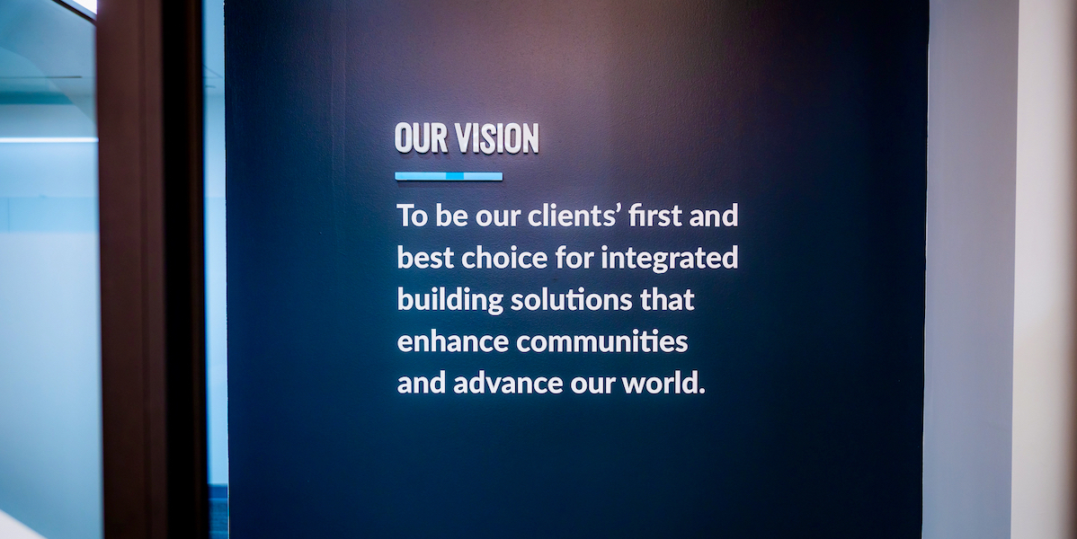
Hourigan, a mid-Atlantic general contractor and construction management firm, infuses their guiding principles into their space through statements on feature walls.
All organizations create and promote guiding principles to help chart their path forward — including elements such as a mission statement, the brand’s vision, and their core values. However, companies will sometimes fail to consistently reinforce these guiding principles outside of the C-suite or marketing arms that generally make decisions about brand positioning.
This often means that the brand itself becomes forgettable to employees — simply due to the fact that they aren’t exposed to it on a regular basis outside of email footers or the occasional visit to the company website. Through workplace design, you can infuse your team’s individual spaces with the elements of your brand that are the most helpful and relevant to them.
For example, you could print your business’s core values in large, plexiglass or vinyl lettering on a wall near the employee entrance, or have canvas photos of members of your team on projects or at industry events to help build a sense of community and inclusion — humanizing your brand in ways that an email footer just can’t.
By reinforcing your culture through thoughtful inclusions to your team’s workspace, you can improve employee buy-in and foster a sense of unity among members that might otherwise not feel very connected to the broader goals of the organization.
Set the tone of your office for employees and clients

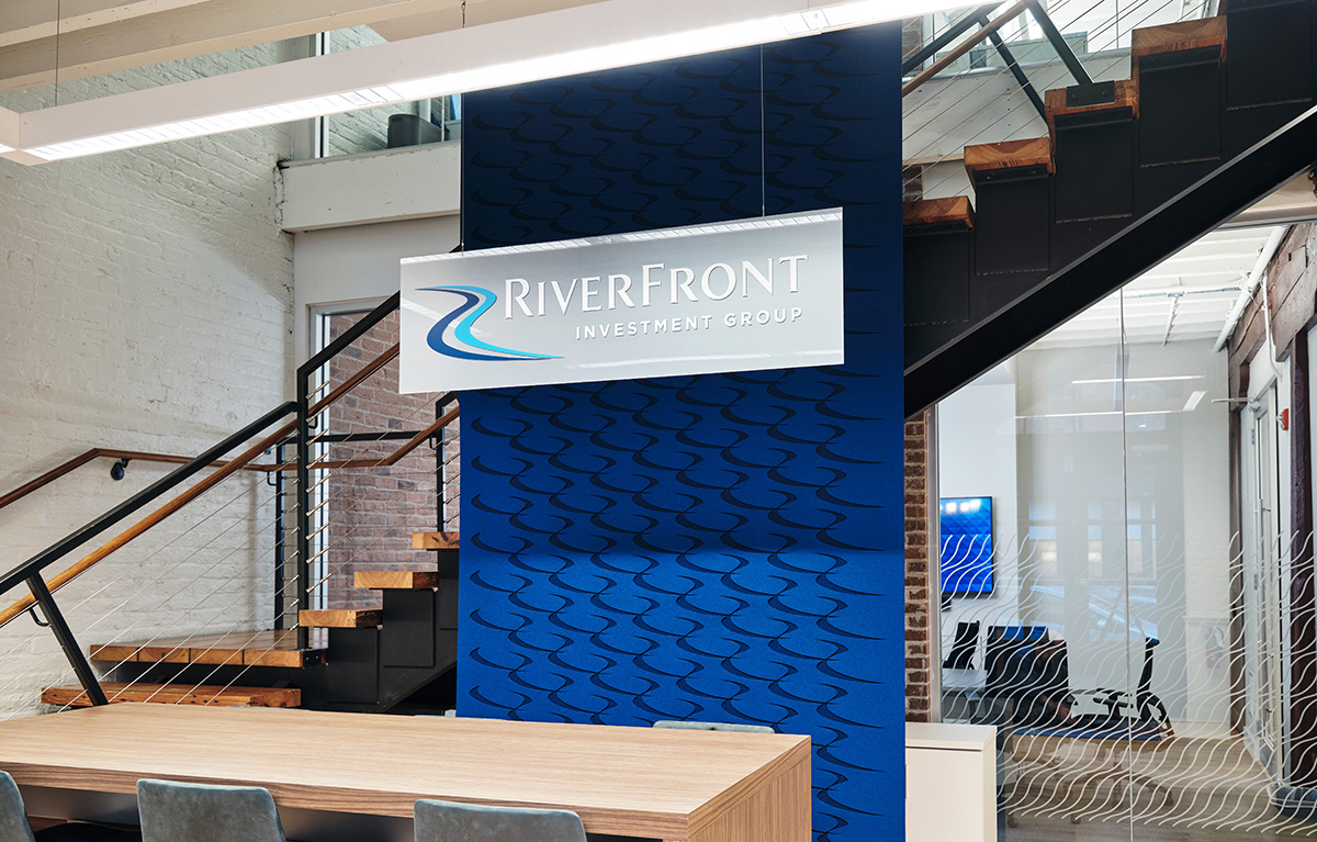
RiverFront Investment Group, a global asset manager, brings in multiple elements of their brand, such as their logo and patterns in unique materials to wow entering clients and employees.
When you imagine the average cookie-cutter office space — before a designer comes in to brighten it up — your mental image will likely include drab carpeting, poor lighting, awkward sight lines, and a forced perspective that make the space feel both claustrophobic and cavernous at the same time.
While new carpets, some colorful furniture, and warmer tube lights in the ceiling may help to make the space more habitable, it doesn’t change the fact that the office will often feel more like an office you’re inhabiting rather than an office that feels like home.
At its most basic level, a superior workplace design strives to capture your brand through physical elements built into your place of work. For example, a snap reaction to entering a law firm might be “wood, books, leather” while walking into a marketing agency with an open concept might make you think “airy, bright, colorful.”
Put more simply, by thoughtfully choosing interior design elements that match your brand, you can infuse the feeling of your brand into the spaces you work in. If your brand has a professional tone, you can choose physical elements that invoke the idea of “professionalism.” If you take a more human approach, elements like murals and photos can help lighten up your space and invoke a friendlier environment.
In doing so, you can surround the individuals who work and visit your space with elements that are uniquely “you”, setting the tone of the experience for both employees and clients the moment they step through your doors.
Gain greater control over your office space

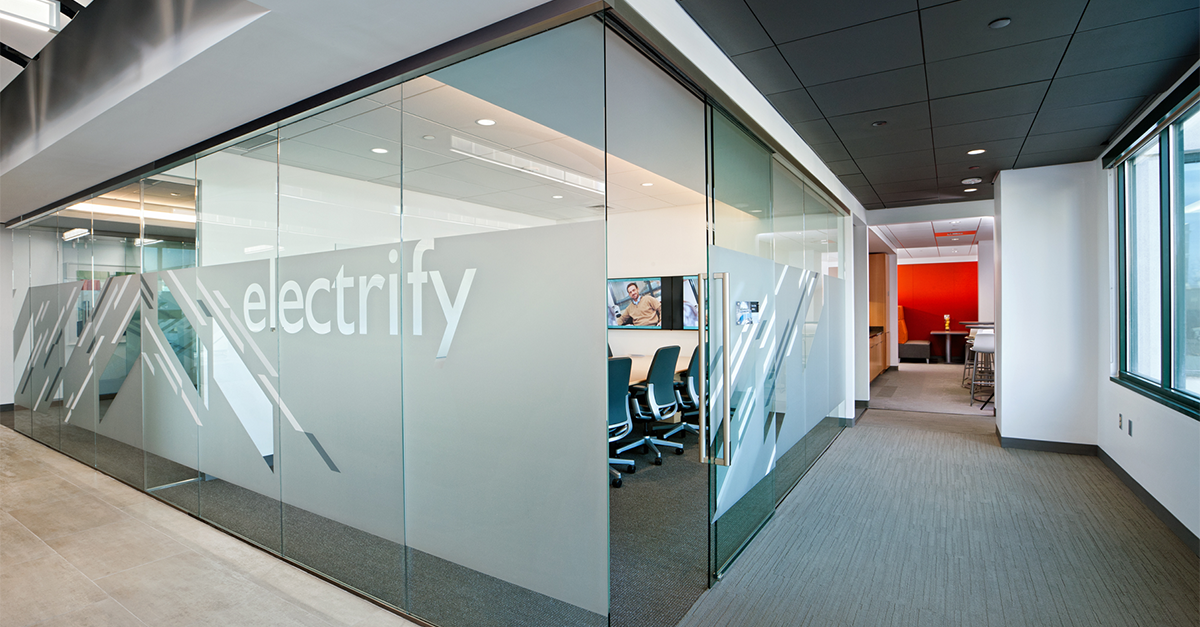
Hourigan Group “electrifies” their office space with patterned frosted vinyl to not only allow privacy, but also give easily visible room naming.
Finally, you should keep in mind that interior design isn’t just for aesthetics — it can be functional as well. There are several ways to use various materials, colors, patterns, and other decorative elements to convey meaning or control the line of sight for people working in or visiting your office.
For example, one common approach is to add semi-transparent vinyl to glass conference rooms to convey a sense of privacy to individuals or clients working in the space. In doing so, you can retain the original function of the glass (allowing people to see in and out of the room) while also having control over the extent of these sight lines (such as concealing hallways or employee workstations adjacent to the glassed-in room).
Another common function of interior branding elements is to improve accessibility and navigation around complicated spaces. For example, you could use brightly colored doors to help visitors navigate your space (“follow that hallway to the first teal door”) or you could create unique names for your meeting rooms to help provide clarity of location (“let’s meet in the Enhance conference room”).
The possibilities are quite literally endless, but the broader point is that workplace design allows increased control over how people navigate in and communicate about your place of work.
Leveraging this increased level of control to the benefit of your employees and clients, then, should be a relatively natural extension of improving the experiences created by your brand.
Design elements to consider
Translating your brand into a physical space can be difficult — especially when no two spaces or offices are exactly the same. For this reason, it can be helpful to think of your workplace design as a “language” with certain rules you can use to express your brand.
Often, this can take the shape of three modes of expression:
- Layout and Office Flow — One element you have control over is the way that people move throughout your office. Try to make sure this layout matches what people are expecting from your brand (e.g. open concept vs. private meeting rooms)
- Brand Infusions — Another aspect you can control is the physical means of expression around your office, including colors, murals, impact statements, choice of materials, and other elements that can help invoke your brand in the physical world (e.g. using unique colors, patterns, or materials to give certain rooms a distinctive feeling)
- Comfort and Functionality — Finally, remember that function is just as important as form when it comes to interior design. Always make sure your design choices serve to improve the usability of the space for your team (e.g. using comfortable chairs, installing panels on walls to deaden sounds, leveraging a consistent color scheme to improve wayfinding and navigation, improving privacy through control of sight lines, etc.)
By making thoughtful, intentional decisions in each of these areas, you can improve the employee and customer experiences in ways that help make your office easier to work in — improving efficiency and making your clients feel more comfortable and at-home in a space they can match to your brand. Both employees and clients will enjoy coming into the office more if the environment is a pleasant experience.
Bringing your design together

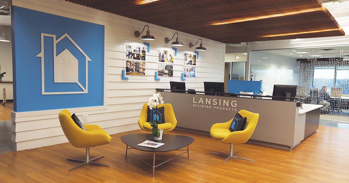
Lansing Building Products, a nationwide distributor of exterior building products, infuses their own products into their space to enhance their brand in the physical environment.
Thoughtful workplace design can help you express your brand in the three-dimensional world — improving the employee experience and helping clients feel more comfortable and confident in their decision to work with your organization.
However, Rome wasn’t built in a day, and it’s important to remember that it takes a lot of strategy, work, and coordination to create a truly unique and authentic office experience. For this reason, you should always approach workplace design with a strategy in mind for how your decisions will impact the people in your space. We choose to always ask the “why” when adding physical elements into a workplace and how that will specifically elevate the brand and office experience.
Only by designing with the end-user in mind can you truly create a space that excites your clients and empowers your employees to deliver on your brand promise at every turn.
"*" indicates required fields
By signing up you are agreeing to our Privacy Policy.