A refreshed brand helps spur growth for a long-term client

Intro
A client for over ten years, Prospera Financial is a boutique broker-dealer with a proud culture of providing exceptional service and support to their advisors who value independence and flexibility. While the foundational elements of the brand that we originally created were still relevant, it was time for an evolution. Inspired by the spirit of Prospera’s team, circle S reinvigorated the brand with powerful imagery and messaging true to their Texas roots. And the rich and warm color palette helps them stand apart from the sea of cool blues crowding their competitive landscape.

Blazing a fresh trail
With independence and flexibility in mind, we created a system of materials that Prospera uses to support new and existing advisors. Presentation templates, an on-demand print portal, several content managed websites and a cohesive brand style guide allow for nimble execution. Of course, we’re always available to serve as a guide.

What was refreshed? Click through the brand elements below.
1
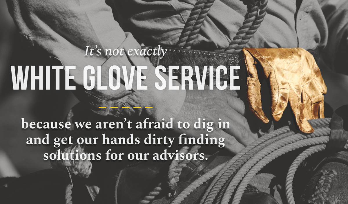
Messaging & Brand Position
The updated brand tone is based on “Big” service- and benefits-oriented language, with a nod to their Texas roots.
2
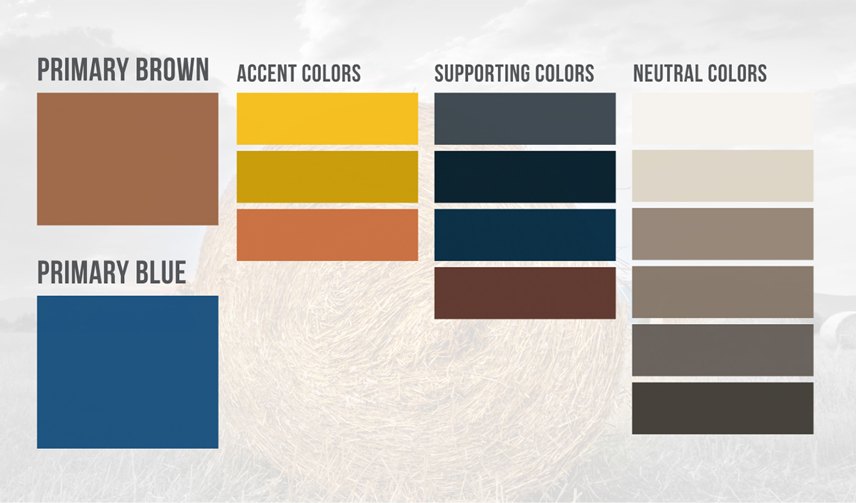
Color Palette
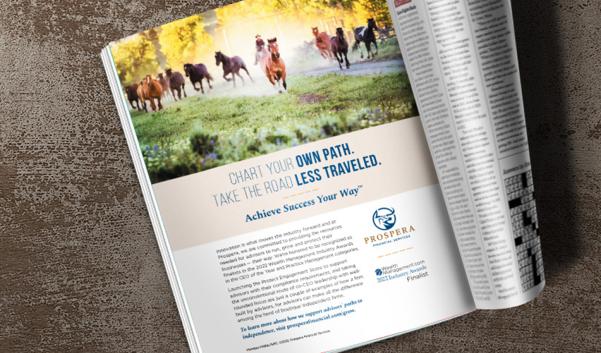
The original color palette evolved to better reflect Prospera’s boutique culture. Rich and warm tones also relate to western photography that was introduced as part of the brand refresh.
3
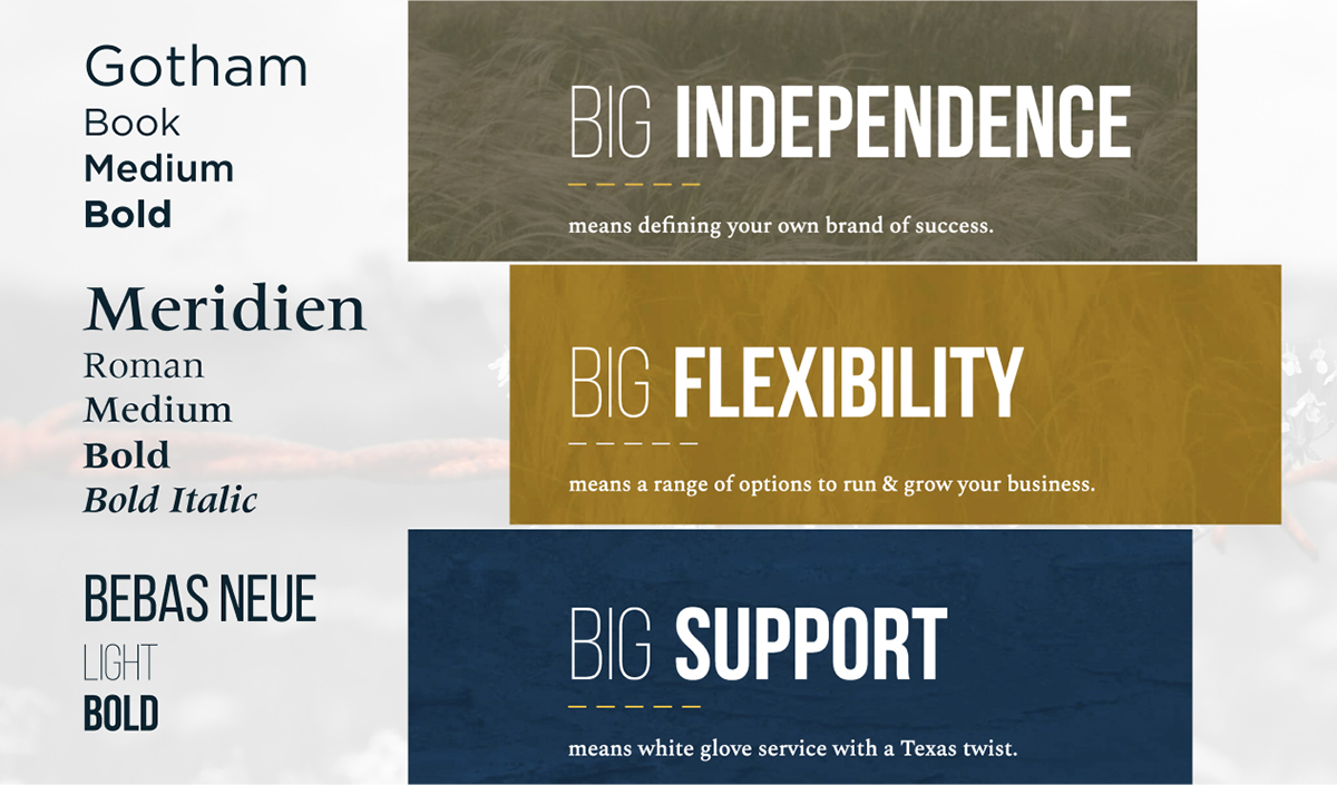
Typography
We implemented a new accent font that pairs with the existing fonts to highlight the “Big” ideas in a distinctive and elegant way.
4
Photo Treatments
We created a distinctive style authentic to Prospera. Western images were converted to black and white with an accent of full color to focus the viewer’s attention.
5
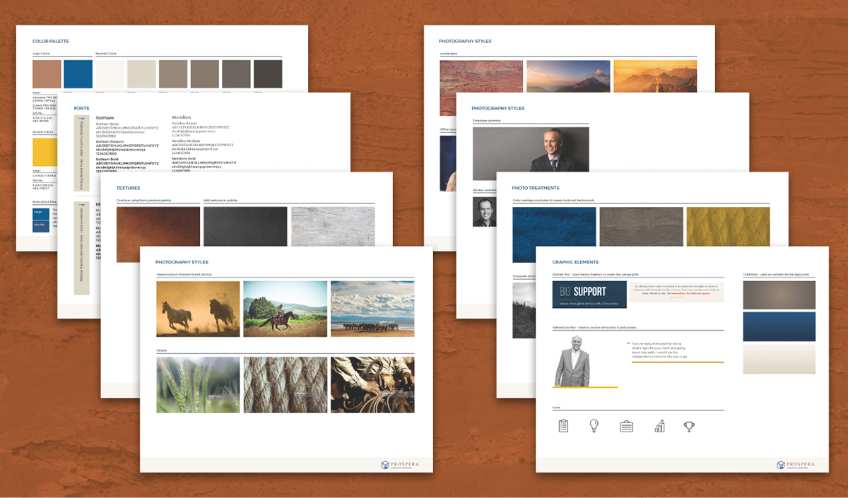
Brand Style Guide
To drive adoption and brand consistency across the team, a brand style guide was created.
6
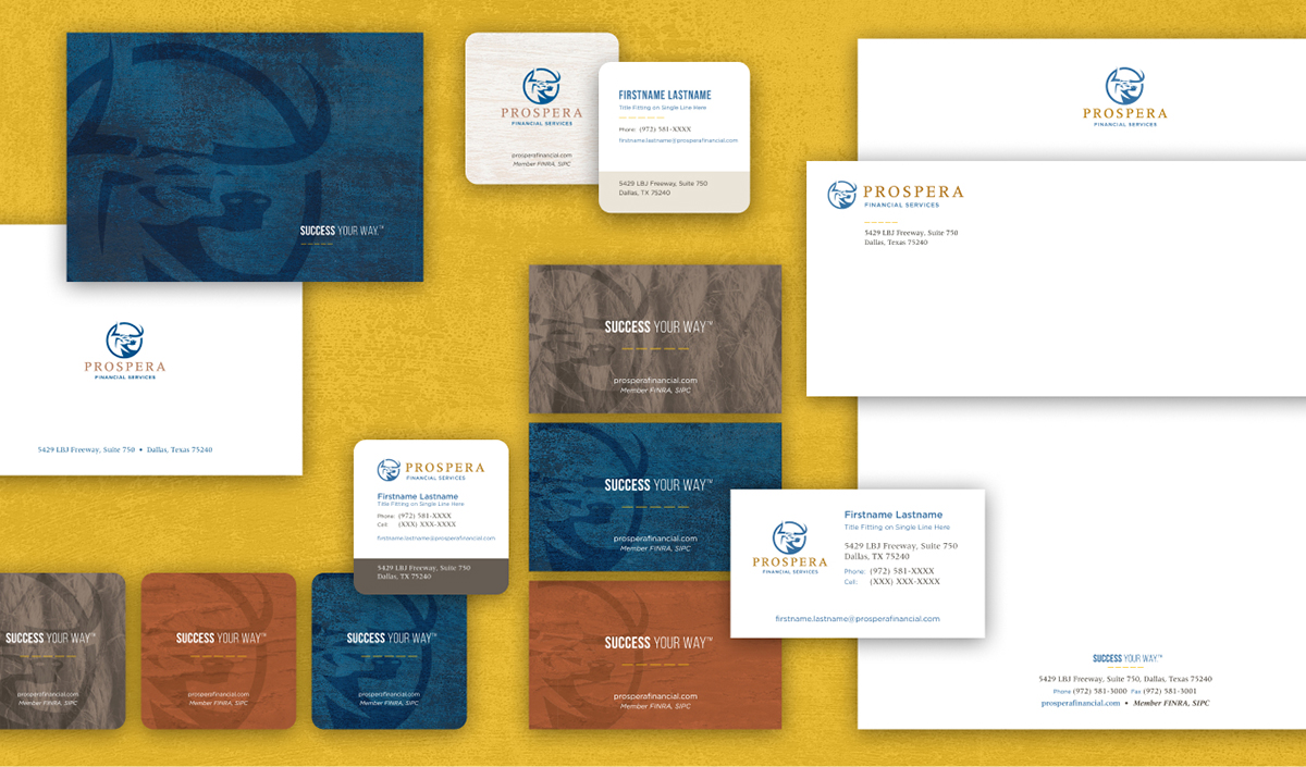
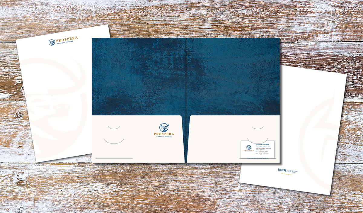
Business Cards & Stationery
A boutique firm deserves a bespoke suite of stationery. Luxe paper, rounded corner options, unique sizes and varied backgrounds were utilized to craft customizable materials available through a print portal.
7
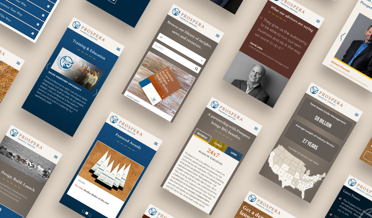
Website
A larger undertaking than the brand refresh itself, the website design is big and bold, much like Prospera’s dedication to independence, flexibility and support. Content led the design, and was focused on showing Prospera’s culture through their people—including advisors and employees—featuring quotes, videos, and a more robust careers page.
Can passion for independence, flexibility and support elevate a brand?
Absolutely. Recognized by Advisor Magazine, Investment Advisor Magazine and WealthManagement.com, Prospera has continued to be nationally ranked for their innovative support. A custom portfolio modeling tool and advisor transition website are just two examples of how they continually strive to meet advisors’ evolving needs. Respect and collaboration are the fundamental values that have driven Prospera’s growth as well as our longstanding relationship.


Below is a short preview of the portfolio tool that circle S partnered with Prospera to design and develop.

/
Related Work
How can a brand share unequaled performance to stand out in a sea of sameness?
Learn MoreHow can a brand express the multifaceted attributes of a dynamic global asset manager?
Learn MoreHow do you modernize a brand that has been in existence since 1869?
Learn More